effortlessly choose the right credit card

User Research
Interaction Design
Visual Design
Brand Design

Adobe
CC

Figma
This project focuses on guiding credit card users to select the right card at the point of purchase. Through iterative feedback from initial wireframes to high-fidelity prototypes, I designed an app and browser extension that uses geolocation to send notifications for purchase discounts, enhancing the user experience during both in-store and online transactions
American credit card users manage multiple cards, each offering different rewards and discounts on purchases like travel, dining, and groceries. However, at the point of purchase, they often struggle to determine which card provides the most value, leading to missed savings and inefficient spending decisions
5
Research Papers
10
Personal Interviews
120+
Survey Responses
Initial project outline questions helped develop scope of the project

'How Might We' questions that helped derive key need of maximizing rewards

Users preferred storing bank transaction cards on the phone

These research methods provided insights into user needs, spending behaviors, and patterns in credit card purchases across diverse individuals. The most prominent findings included:
- Americans manage multiple credit cards: In 2023, 82% of U.S. adults, around 190.4 million people owned credit cards, with an average of 3.84 cards per person
- Maximizing rewards drives credit card usage: The top reasons for using credit cards in 2024 included one-time bonuses, cash back, reward points, and airline miles
- Users struggle with choosing the best card at checkout: 72% of credit card owners reported regret over missing out on potential rewards or benefits after completing a purchase
These insights shed light on how users navigate credit card rewards and decision-making at the point of purchase, guiding the next steps of the project
The app helps users manage and make credit card payments for both online and in-person purchases, recommending the card that offers the best value for money from their wallet
Use the toggle to switch to dark mode
Dashboard
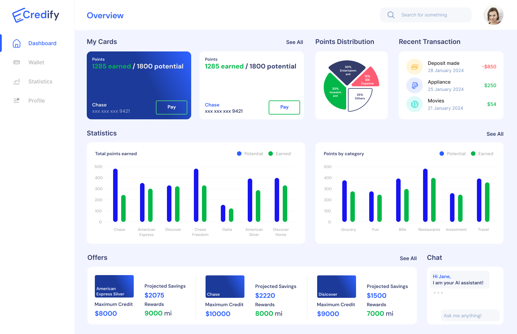
Users can view their total rewards won across different cards and key insights here


Tailored graphs
Track your total points earned across customizable graphs


Add cards
Users can add a card without bank details or provide more information for a tailored experience


Push notifications
Users get suggestions based on their geolocation for choosing the right card at payment


Web Extension for Online Purchases
Web extension and app UI seamlessly intigrates with online purchasing channels

The Credify site map outlines the platform’s structure, highlighting key features like card management, reward tracking, and personalized recommendations for a seamless user experience

Survey responses and naturalistic observations of credit card users led to the creation of three key personas, representing the majority of participants. These personas helped define the target audience for the solution

She is an independent clay artist selling on Etsy and travels globally for inspiration
she often accidentally uses her business card for personal expenses

A serial entrepreneur with major stakes in multiple Silicon Valley tech startups
He strategically uses multiple credit cards for specific needs, including travel, shopping, hotel bookings, and daily expenses

After a decade of job market struggles, he has finally started building his own house
He values every dollar spent and prioritizes maximizing rewards through his various memberships
The initial sketches and paper prototypes played a key role in refining the wireframes and overall site map, guided by insights from task analysis
I did a quick ideation for the different screens to be used by the user

Using the paper prototypes I conducted task analysis with a pool of 10 users to identify workflow problems

I constructed a paper prototype to analyze user interaction through task analysis

I conducted user testing with a concentrated group, gathering feedback that emphasized the importance of features like pod reservation floor schematics. Based on these insights, I developed a low-fidelity wireframe with a well-structured and user-centric flow

Users found it difficult to add a card using the external device

Replaced physical device with NFC transactions directly from the user's phone

Added an offers tab using material guidelines to help users know about other cards and bank offers
Through the user journey I was able to reiterate on the mid fidelity prototype without having the physical device and enabling NFC payment through phone interface
These sketches illustrate the user journey of a consumer making a purchase

Explored a web extension module that provides a detailed dashboard, allowing users to manage their app and make informed choices during online purchases

I developed an interactive wireframe prototype to test affordability of the app

Credify is a network of interfaces designed to liberate a credit card user from the decision paralysis during purchases. This was kept in mind while selecting colors and font for the app
- Dm Sans was chosen for its clean, modern aesthetic, it enhances readability and creates a sleek, professional look that aligns with Credify’s user-centric, finance-focused design
- The use of blue conveys trust and reliability, while green symbolizes growth and financial well-being, together fostering a sense of security and prosperity within the Credify brand

Following the brand guidelines, I created a functional prototype in Figma to assess the design, incorporating iterative refinements that ultimately resulted in the final app screen mockups

- Streamlined Financial Management: Designed an intuitive app ecosystem that simplifies credit card management, helping users make informed payment decisions for both online and in-person purchases
- Personalized Solutions: Developed key functionalities like personalized card recommendations and expense tracking, driven by user research and testing to meet diverse financial needs effectively
- Impactful Visual Identity: Crafted a cohesive brand experience across light and dark themes fostering trust, growth, and seamless navigation throughout the app